TeamGram gives you easy access to many details about your company’s sales management. You can customize the standard graphics and report screens under “Dashboard” in the TeamGram menu. When you want to see all the details about your company at a glance, just the information about sales or order may not be sufficient.
With TeamGram “Custom widgets”;
- You can add reports specific to your company
- You can view the information you want except for sales and orders
- You can view all the information about your company on one screen
- You can make quick decisions and manage your company more effectively.
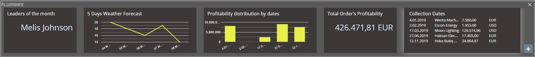
Using this feature, you can place your own graphics or tables on the page you reach by clicking on the “Sales dashboard” panel on the sales pipeline and/or “Dashboard” in the top menu.
In order to create Custom widgets in TeamGram, your excel file containing the widget data must be saved in Google Drive or Microsoft OneDrive. Using this excel file saved on the Drive, you can have the reports displayed with your choice of single value, bar chart, time series or list type widget options.
How to create a custom widget?
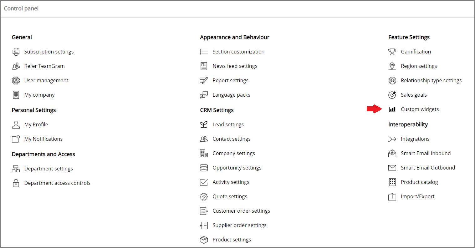
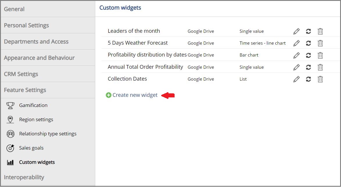
You can create your widget by filling in the information requested from the “Control panel”> “Custom widgets”> “Create new widget” step.
Widget name *: You must provide a name that allows you to distinguish between your widgets. This name will appear when you select the dashboard display area.
Explanation: If you want to be a reminder about the usage of your widget, you can enter a short explanation.
Where to show *: You need to choose the title you want to follow your chart or chart. You can make it appear in the sales process and/or Dashboard title.
Refresh interval: When you update the information in the Drive file, the widgets also change according to the refresh interval time. In cases where you want the update to be reflected immediately, you can manually update it by simply clicking the “Update” icon next to the widget from the “Control Panel”> “Custom widgets” step.
Widget type: You can choose the type that will show your data correctly according to the content of your report.
- Single Value: You can use it when you want to show text or a single number.
- Bar Graph: It is used to distinguish between categories and show numerical comparisons by using horizontal or vertical columns.
- Time Series Graph: It provides statistical analysis of the data observed at regular intervals over time and forecasting of data that can be obtained in future periods.
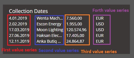
- List: It is a widget type that allows you to see your data in a list in order. Up to 4 columns (index) can be created.
Targeted users: You should choose the users or departments you want to see your widgets.
Data source: You can choose Google Drive or Microsoft OneDrive from the list.
File: You must select the file you will use for the widget via Google Drive or Microsoft OneDrive.
Sheet: You may have more than one sheet in your file, so you can choose the sheet you want to use after uploading your file.
Preview: You can easily view from this screen without registering what your display will look like based on the cells you selected. If you make changes in the data entry fields, you need to click on “Refresh preview”. So the preview will be updated.
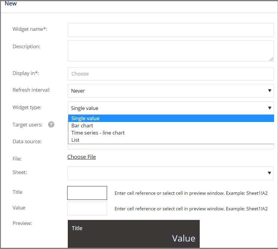
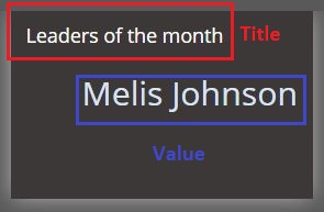
Data entry fields specific to single value display type
- Title
- Value
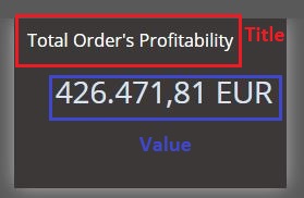
Data entry fields specific to the bar chart and time series display type
- Data array and Data point number: Enables the selected cell in the file to be selected up to a certain number horizontally or vertically based on the number of data points.
- Horizontal axis sequence start: It is the point where the information in the horizontal position of the graphic is selected.
- Value axis array start: You can select the values you want to be on the vertical line to the left of the chart.
Data entry fields specific to list indicator type
- Data series start: The cell area where the information you want to be included in the columns is selected.
- Number of data points: The number of data points to choose from below is determined by the number of data points.
- There are column headings in the first line: If you have a title in your file, if you check this box, these headings will be taken as a basis.