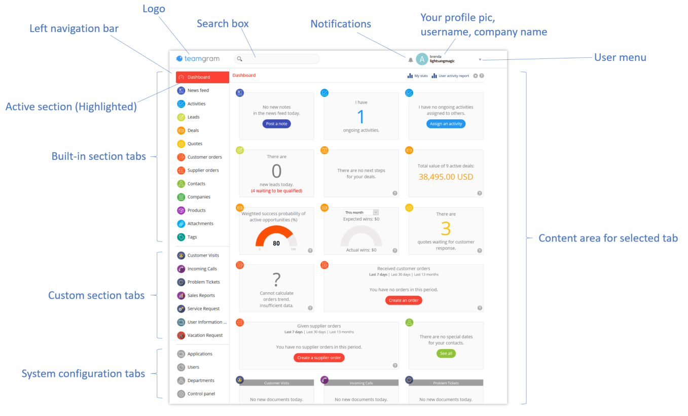
TeamGram has a consistent user interface throughout the app. Here are the main parts:

Logo
Clicking on the TeamGram logo will always take you to the news feed page. Your system administrator can replace this logo with your company logo.
Left Sidebar (Navigation bar)
The left sidebar lists quick links to jump to different sections in TeamGram. The contents of the sidebar can vary depending on how your administrator sets up the system.
When you hover over a section tab, it will be highlighted slightly. When you click on it, it will be highlighted more strongly and the content area of the page will be refreshed to show the selected section.
- Built-in section tabs display standard sections that come with TeamGram.
- Custom section tabs are added when your system administrator adds new custom forms (apps) to your TeamGram space. These allow adding completely new features into TeamGram.
- System configuration tabs let you access various settings about your TeamGram account.
Content Area
The large area to the right of the left sidebar displays the contents of the selected section.
Search Box
TeamGram automatically indexes every information you put into it. To retrieve a record, all you need to do is to type in some relevant keywords here and press the enter key.
Notifications
TeamGram will notify you when there is something that needs your attention, like a new task assigned to you by a coworker. When there is a new notification, the bell symbol at the upper right corner will be highlighted. Clicking on it will list your notifications.
User Menu
Your profile picture, username and company name are displayed at the upper right corner. Clicking on this area will reveal the user menu. This menu has options to change your profile picture, language, personal preferences, get help, and logout.
